

When creating a resume, one of the first concerns that comes to our mind is whether the font you pick is a big factor in your job competition or not. Yes, this will have an impact on your job-hunting to some extent. First, let’s start by looking at the top resume fonts.
Top ATS resume fonts in 2022
1.
2.
3.
4.
5.
6.
7.
8.
9.
10.
All these resume fonts are safe choices for you to add to your resumes. Continue reading this article to know the reasons why we chose the fonts mentioned above for our list.
01. Calibri
Luc De Groot invented Calibri in 2005 which is a basic and global sans-serif font. It’s also a clean-cut modern resume typeface. Gmail and Microsoft Word also use it as their default font. That font is already well-known among hiring supervisors. As a result, people will have no trouble reading a resume created with Calibri typeface.
- Category: Sans-serif
- Classification: Humanist
- Best for: Teaching, nursing, and caretaking applicants
- Download link: downloadfonts.io
- Alternative fonts: Open sans, Alègre Sans, Raleway, and Helvetica Neue

02. Cambria
Cambria is a serif font created by Jelle Bosma, a Dutch typeface designer, with the help of Steve Matteson and Robin Nicholas in 2004. When used on a résumé, this typeface can make it readable even in small letters. As a result, this typeface is appropriate for both the web and print versions of your resume.
- Category: Serif
- Classification: Transitional
- Best for: Law, education, banking, and finance applicants
- Download link: downloadfonts.io
- Alternative fonts: ITC New Baskerville, Ragnar, Times New Roman, and Rotis Serif

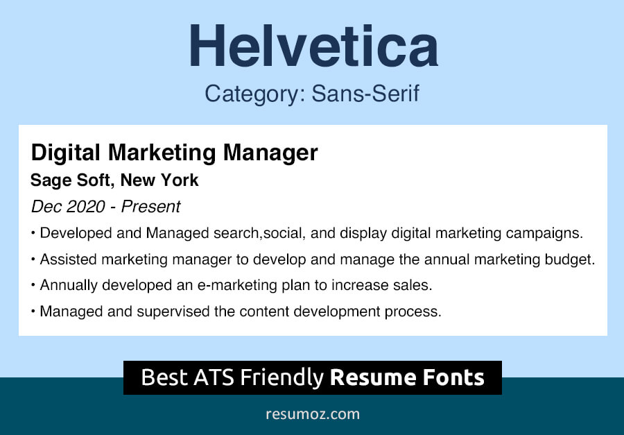
03. Helvetica
Helvetica is a popular sans serif typeface created by Max Miedinger and Eduard Hoffmann in 1957. The renowned typeface Akzidenz-Grotesk influenced Helvetica. Career experts recommend this font to be on the resume titles and section headings as this is a very clean and clear font.
- Category: Sans-serif
- Classification: Neo-grotesque
- Best for: Sales, marketing, and customer service applicants
- Download link: Linotype
- Alternative fonts: Akzidenz Grotesk, ARS Maquette, and Brandon Grotesque
04. Garamond
Garamond is a serif typeface created in 1989 by Claude Garamond. On printed resumes, Garamond is ideal. Garamond will allow you to include more information on your resume by reducing the font size without diminishing legibility.
- Category: Serif
- Classification: Old-style
- Best for: Accounting, real-estate, and law applicants
- Download link: wfonts
- Alternative fonts: Eason, Marat, Maiola, and Sabon Next

05. Georgia
Georgia is a serif typeface created by Matthew Carter in 1993. Since this font is darker than the others, it is more visible even at smaller font sizes and is also more comfortable to read. Georgia also has the advantage of being crystal clear on low-resolution screens.
- Category: Serif
- Classification: Transitional
- Best for: photography, designing and creative field applicants
- Download link: downloadfonts.io
- Alternative fonts: Crimson Semibold and HK Venetian Regular

06. Arial
Arial is a very versatile font. The Arial font, which is often used for most documents, has become very popular as a resume font. This font was created in 1982 by Robin Nicholas and Patricia Saunders. Since this is a very common font, recruiters are likely to be less interested in reading the resume with Arial font. However, there is no better font for your resume to pass the ATS test.
- Category: Sans-serif
- Classification: Neo-grotesque
- Best for: IT, engineering and academic field applicants
- Download link: downloadfonts.io
- Alternative fonts: Poppins, Raleway, Montserrat, and Roboto

07. Didot
Created by Firmin Didot in 1799, the Didot font is ideal for anyone applying for a job in the creative industry. This font, which belongs to the serif category, is recommended by experts to use in headings and resume titles.
- Category: Serif
- Classification: Didone (Modern)
- Best for: Graphic designers and photographers
- Download link: ufonts
- Alternative fonts: Gill Facia and SG Garamont Amsterdam SB

08. Book Antiqua
Book Antiqua is considered one of the best serif fonts to use in resumes. And it is a clone font of Palatino which is owned by the Microsoft Corporation. Due to its professional look and geometrical design, this font is a perfect match for resume headings.
- Category: Serif
- Classification: Humanist / Old-style
- Best for: Arts and humanities professions
- Download link: Microsoft Fonts
- Alternative fonts: Palatia Regular, Queens Park, and Gemerald

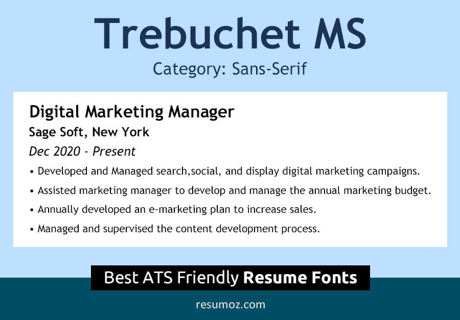
09. Trebuchet MS
Trebuchet MS is considered one of the best web fonts. Due to its stylishness and beauty, it is a heartfelt resume font for most job seekers in the creative industry. Trebuchet MS is a rounded and friendly font with soft curves that was designed by Vincent Connare in 1996.
- Category: Sans-serif
- Classification: Humanist
- Best for: Designers, social media roles, sales & marketing professionals and entry-level applicants.
- Download link: cufonfonts
- Alternative fonts: Fira Sans and Source Sans Pro
10. Tahoma
Tahoma was designed by a renowned font specialist named Matthew Carter in 1994 for Microsoft Corporation. Tahoma’s regular font type is ideal to use in anyone’s resume as the body text. It has a very crisp appearance with a modern look. So, Tahoma font goes well with the resumes of applicants who are going to apply for tech-related jobs.
- Category: Sans-serif
- Classification: Humanist
- Best for: Software Engineers, Web Developers, and System Administrators
- Download link: myfonts
- Alternative fonts: Africa and Clear Sans

The importance of good resume fonts in 2022
The resume font you choose will affect your job search due to several reasons. So you have to be very careful when choosing fonts for your resume.
The first and most important reason is that every resume will go through an ATS scan. In order to pass the ATS scan, you must follow the resume best practices to beat ATS. One of the greatest tips to beat ATS is to use a clear and standard resume font. So the applicant tracking system will not be confused when scanning your resume. Therefore, you can understand that resume font really matters.
On the other hand, your resume is often manually inspected by a hiring manager. In such a case, if the resume font you are using is difficult to read and is not a standard font, Hiring Manager may find it difficult to read your resume which means that your resume tends to be rejected by him. So the font should not be distracting to the recruiter or the reader of your resume. As a result, he can focus more on the content of the document.
Tips to choose the best font and font-size for a resume
Usually, applicants do not pay much attention to font selection when building a resume. But it is something that you should definitely pay attention to. The main expectation of your resume is to highlight your skills and abilities. So if you choose a good resume font, it will be easier for you to do the above.
So let’s see how to choose a good font for your resume.
Check whether the font is professional and easy to read
Always make it easy for your prospective recruiter to read your resume. Therefore, do not confuse him by including fonts that are difficult to read. As much as possible, limit yourself to the fonts we have recommended above. Because they all are proven-success resume fonts.
Avoid using “thin” & “light” fonts
The main reason for this also is the readability of your resume. Thin fonts and light fonts are usually considered hard-to-read fonts on a screen. We can not say for sure that your recruiter will always print your resume and inspect it. So do not endanger your resume by using such fonts.
Use the right font size
The font size is a bigger factor than you think when creating your resume. Limiting your resume to a single page or a maximum of two pages is one of the resume best practices. So if you use a slightly larger font, your resume will be longer than the standard resume length.
Leave only the most relevant career information of yourself and remove all other irrelevant information and keep your document at the proper resume length.
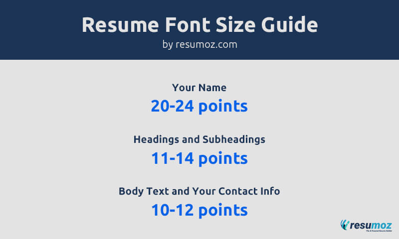
So whenever possible you should try to keep the body text on your resume between 10-12 points. If you use a font size less than 10 points it will make it difficult for the reader to read your resume.
However, your resume requires the use of different font sizes for your name, headings, and subheadings, as well as the body text and contact information. Follow the best resume font size guide below and modify your resume accordingly.
Add style to your resume font
The best way to stand out your resume is to use basic styling such as bolding, underlining and italicizing. But your whole resume should only be in single font type. However to keep the consistency of your resume we recommend bolding and italicizing is enough as it does not cause any harm to the professionalism and the readability of your resume.
For example, you can use italic fonts when stating the city and state, company/institution names, and dates. You can also use bold fonts when mentioning the job titles in the resume work experience section.
But never use underlined fonts as your resume text. Because nowadays, just seeing an underlined text reminds us of a hyperlink. Not only that but also reading underlined text is a bit difficult for the human eye as well as the resume bots.
Different color fonts in a single resume?
It’s your job to make your resume stand out more than any other resume. There are many tricks to doing that. These include the use of action verbs, quoting job titles, and including LinkedIn profiles, etc.
But did you know that adding fonts with different colors to your resume fonts gives more life to your document?
Yes, this is a very successful method. But you should be careful not to spoil your resume for this reason. Never use more than two colors in your resume.
The best option is to apply your theme color to the headings and subheadings and apply black color to the body text.
Note: It is fine to use colors on your resume if it is an entry-level or executive level resume. But if you are writing your resume for a federal/government job, avoid using colors on resume fonts.
Use of italics and bold fonts in a resume
The best way to emphasize the information on your resume is to use bold letters and italics. We recommend bolding and italicizing as it does not cause any harm to the ATS friendliness of your resume.
For example, you can use italic fonts when stating the city and state, company/institution names, and dates. You can also use bold fonts when mentioning the previous job titles.
But never use underlined fonts as your resume text. Because nowadays, just seeing an underlined text reminds us of a hyperlink. Not only that but also reading underlined text is a bit difficult for the human eye as well as the resume bots.
Serif vs Sans-Serif – What should I use?
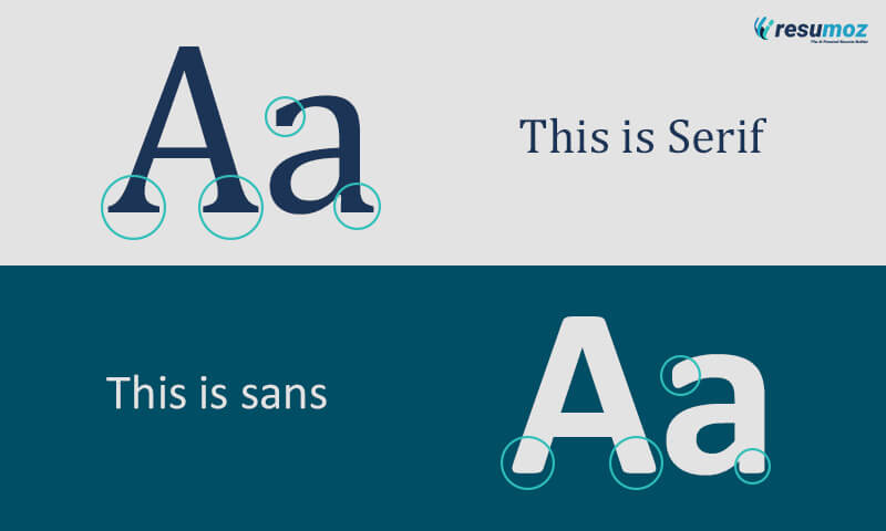
What does it mean by a serif?
A serif is a decorative line or curls attached to the end of a letter stroke. Usually, such fonts have a Roman antiquity look. A font family with these features is called a serif typeface.
What is a sans-serif font?
Sans-serif (or without serif) refers to font types without decorative styles and curls. Due to its clean and modern look, and sleek design, the designers recommend sans serif fonts for resumes.
Serif or sans-serif for my resume?
This is a problem for many people. The first thing to note is that no matter which font type you use but be careful when mixing both in your resume. This can cause a lot of damage to the readability of your resume. But you can use the font combinations that we recommend only if it is necessary for you.
According to the font specialists, the easiest font to read is serif fonts. Due to its curly and decorative styles, the hiring manager can quickly and easily capture your resume content.
However, as career experts, if the job you are applying for is modern and tech-related, we recommend you to use a sans-serif font. But if you are applying for traditional jobs, you can get more results by using a serif font.
Best resume fonts combination
We always tell you to limit your resume to just one font to maintain its consistency. But anyhow if you need to use two fonts, you could go for two fonts. But never use more than two fonts in your resume.
Below are some of the best font pairings for headings and body text on your resume. All of these have been used for resumes and have proven their success.
- Georgia and Verdana
- Helvetica and Garamond
Which type of fonts to avoid in a resume?
In addition to what we have recommended above, there are more resume fonts available that are acceptable. But there are many factors to consider when choosing them.
Do you know how to identify poor resume fonts in advance?
If a font you choose is:
- very stylish font
- a thin, light, narrow, or condensed font
Then we can identify them as fonts that are not suitable for resumes.
Key Takeaway
And last but not least, no matter what font style or font size you use, you already have a good font if you can ensure the cleanliness, neatness, and readability of your resume.